Photo from lexmark.com
Background
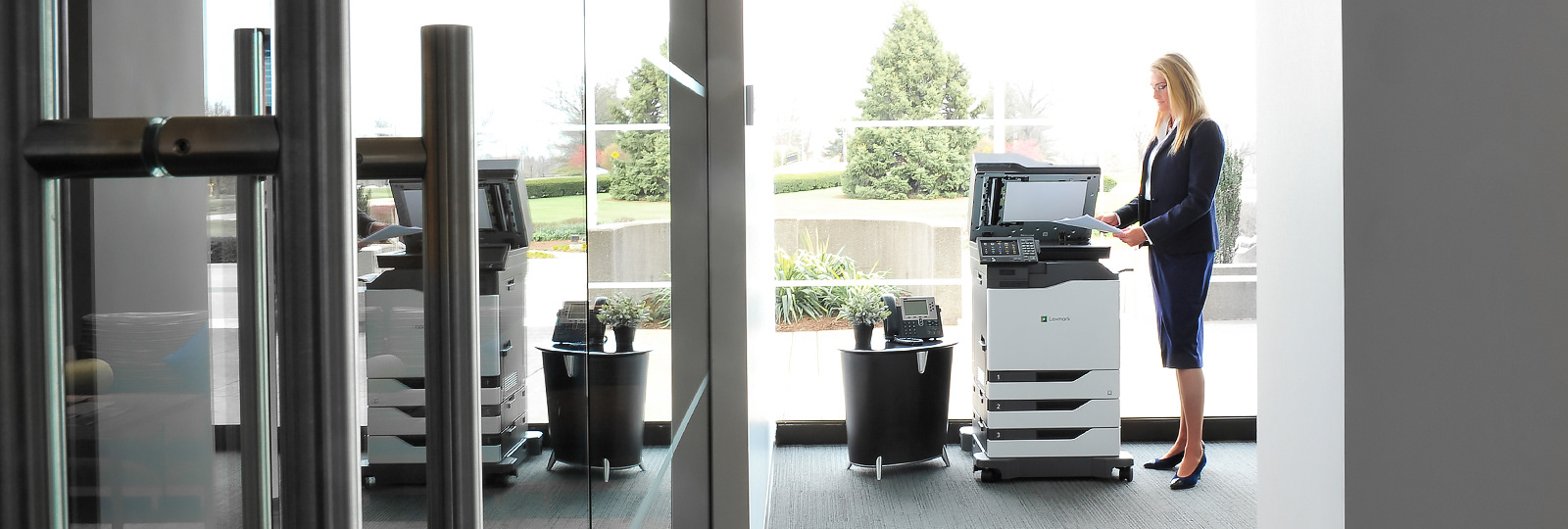
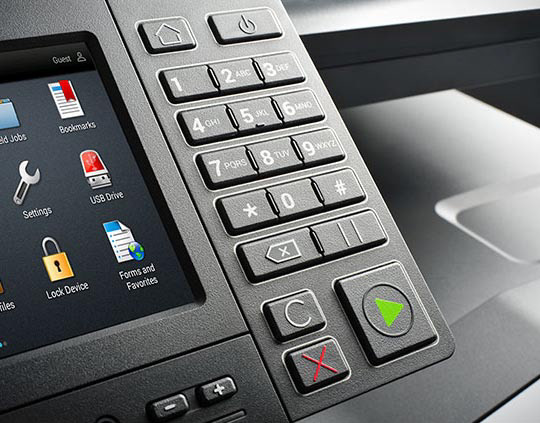
For years since conception, Lexmark printers have had tactile keypad for performing quick tasks and ease-of-use on high-end corporate printers. The company has resisted removing it until in 2018 when an initiative coming from top management to completely remove the tactile keypad in the printers and bring it on-screen. This is to reduce manufacturing costs, maintenance, and overhead which bubbles up the longterm costs. The challenge was to have it accessible on-screen while allowing familiarity with the good-old tactile keypad within a limited panel real estate.
Problem
The problem is to define where, when, and how the on-screen keypad access is shown in the printer panel while leveraging on prior knowledge of users and new users of Lexmark printers.
Roles, responsibilities, and teammates
As part of a UX team, I helped out on UX Research and was responsible for the Interaction Design. I collaborate frequently with the UX team, Product Owner, Hardware Engineers, Firmware Developers, and the QA team.
Goal
Define and design the best location, interaction, and behavior of the on-screen keypad access while allowing users to perform other printer tasks.
Scope
Design the on-screen keypad access in printer panel screen for 4.3" and 10” sizes that will be recognizable and will not hamper user tasks.
Process
The process was iterative and merges within discovery, research, design, and validation.
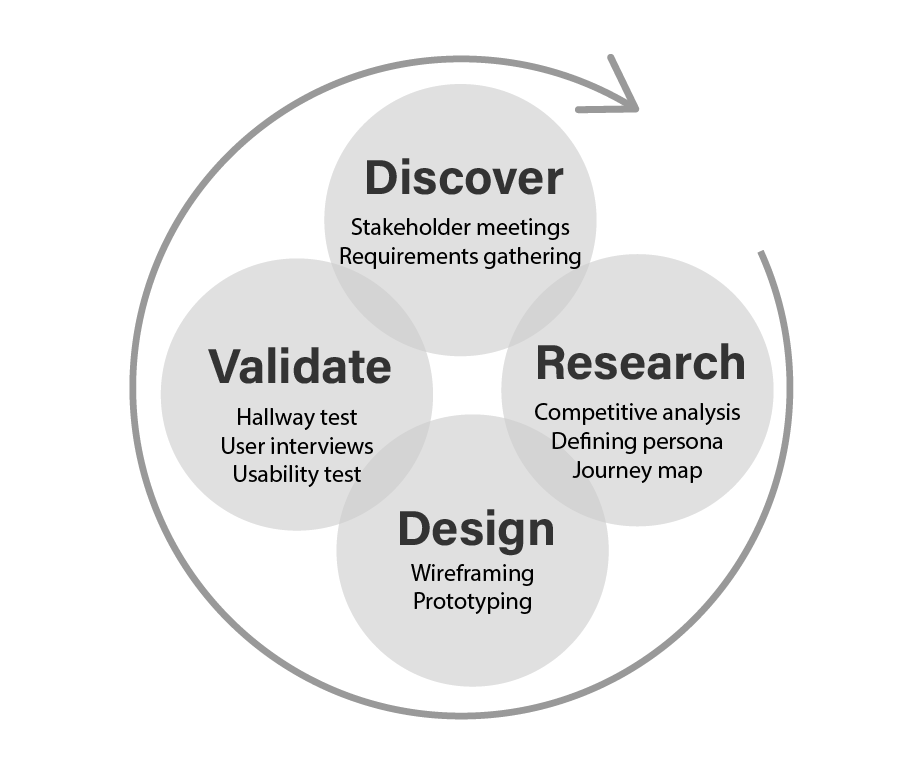
Discover
Based on the collaboration with different stakeholders and the requirements gathered, the following problems need to be addressed by the UX team:
• Design should be consistent for 2 screen sizes.
• Access to the keypad should be readily available even if the user is on another task.
• The printer's limited memory capacity can reduce animation to minimal.
• Design should be consistent for 2 screen sizes.
• Access to the keypad should be readily available even if the user is on another task.
• The printer's limited memory capacity can reduce animation to minimal.
Research
Based on the problems, the following Research Questions were formulated:
• When do users need the on-screen keypad?
• Where should it be positioned to avoid obstructing the other tasks?
• How do users want to access the keypad?
• When do users need the on-screen keypad?
• Where should it be positioned to avoid obstructing the other tasks?
• How do users want to access the keypad?
In order to answer the research questions, the following UX Research Methods were conducted:
• Competitive analysis and assessment
• Hallway tests
• Usability testing
• Competitive analysis and assessment
• Hallway tests
• Usability testing
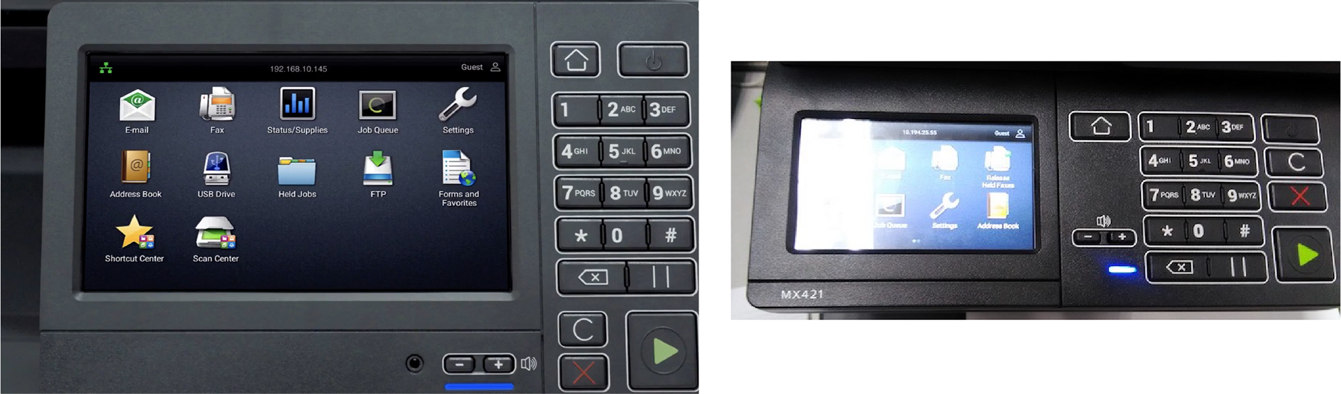
Competitive Analysis and Assessment
We looked at competitor products within the market segment to see trends and advantages. This also became an early benchmark for how we use the small touchscreen printer.
Persona and Journey Map
This method showed that the user's pain points happen when an unclear interface and a small press area causes to open apps or features that were not intended to. In the end, the user becomes frustrated due to the time and effort that is wasted trying to do a simple task. So, accessing the on-screen keypad without erroneously opening other proximate apps is imperative to the user.
Answering the questions raised in defining the problem:
When will the keypad be shown?
Accessible on-demand even if the user doing other tasks
Where will the keypad be shown?
Ideally, non-obstructive when the user is doing other tasks
How will it be shown?
in 2 views, appropriate affordance and metaphor to depict keypad access on the collapsed view, and a familiar expanded view for the familiarity of old features.
Design
The following design solutions were proposed based on the insights gathered.
Button size is key
Create adequate touch areas ( >10mm ) and have enough vertical space to aid users for correct presses. Eliminating errors in presses helps users access the keypad and perform tasks they intended to without disruption.
Iconography
In order not to obstruct the normal printer usage, a small area is dedicated for keypad access. This became a limitation and an area to use only icons as a signifier on accessing the on-screen keypad.
Denoting interaction through the signifier
How a user interacts (tap, scroll, drag, or pinch) with the interface depends on what affordance of the access points look. This shapes the user's expected behavior of the interface, whether to tap or to drag.
Animate like the real world
One of the 10 Usability Heuristics defines the match between the system and the real world which means that the interface should be able to represent the real-world interaction so as to keep the prior knowledge and experience to shape the expected behavior.
Wireframes and sketches
It was important to get the measurements for the press areas, locations in the panel that will not obstruct other printer functions before gathering design concepts.

Of the many concepts presented, a quick prototype was designed and has undergone through the hallway test. Hallway test is a quick and dirty design validation where the designer will walk through the hallway and insights by anyone who passes by. This method may not be that accurate but you quickly get ballpark and insights to quickly move to the next design process.


Prototype
Of the many concepts, 4 were agreed within the UX team to undergo usability testing. These were later designed into high fidelity prototypes with clickable fields, then mirrored to an iPad to replicate the touch screen experience, with its appropriate screen sizes. A bezel cover is also added to replicate the printer frame around the screen which also adds restriction of the press area on the edge.

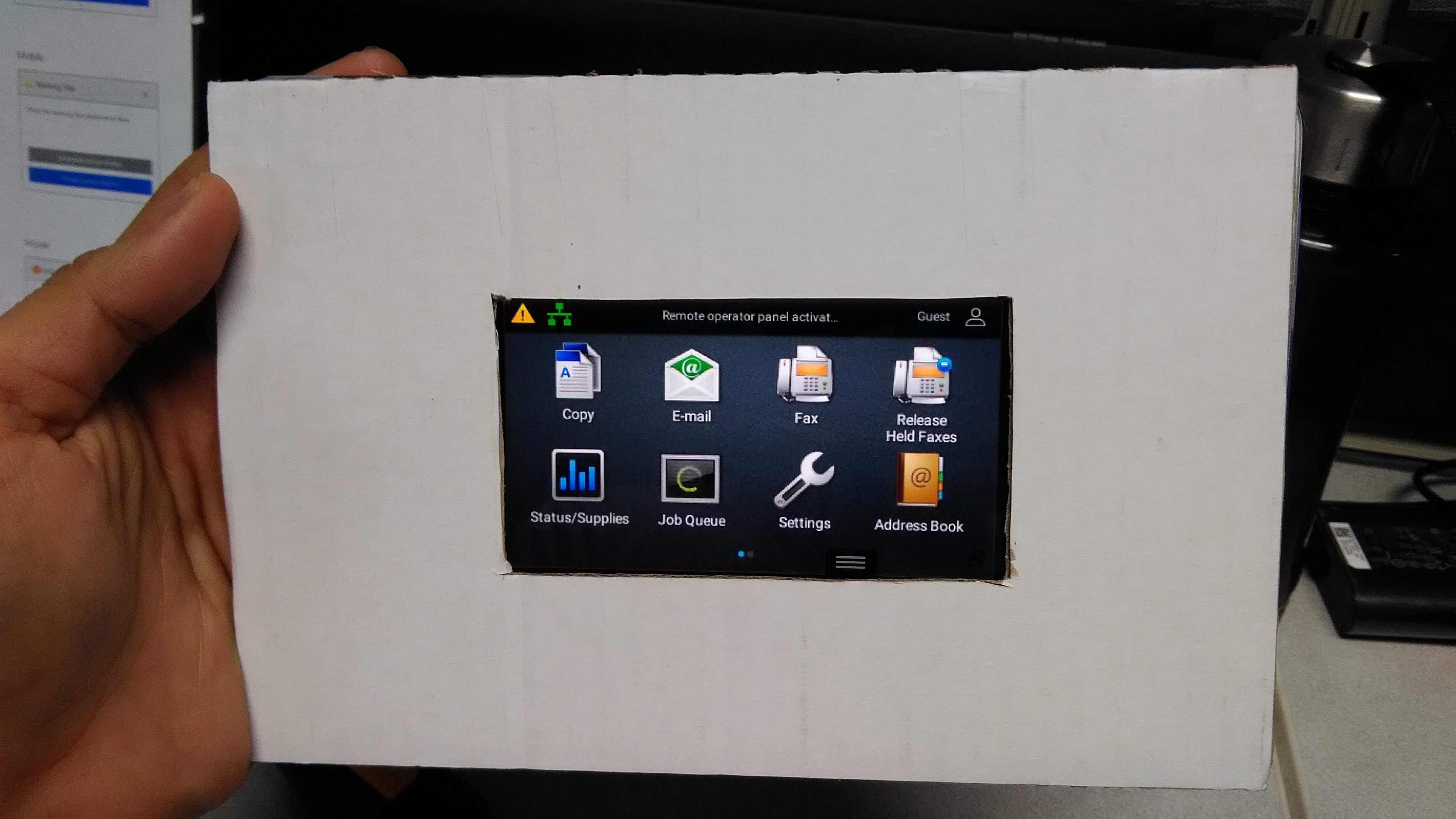
Fail areas were added to verify the access recognition and difficulty level of the interaction. If the user presses in this area, an screen will pop-up which is to notify the moderator of the mistake. This is intended to know if the participant can identify the keypad access and also to know if this can be accessed easily.

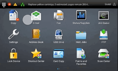
STATUS BAR KEYPAD ICON
This concept is one proposed from the management, key stakeholders and the engineers since it is perceivably straight forward and easy to recognize. As seen on the picture, the icons next to it are printer status showing network connections, print jobs and others.
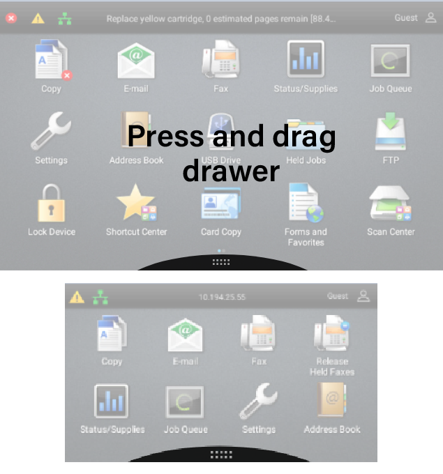
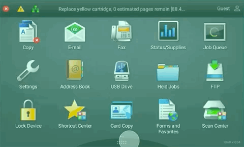
PRESS DRAG BOTTOM DRAWER
The bottom drag is a natural concept since the Lexmark printer panels, at that time has a top drag which makes. it easy to add a bottom drag for accessing hidden features. One issue is that it takes away some space for the pagination indicator.
Due to the limited space, no symbol of a keypad is shown, instead a signifier of a pull or swipe interaction is shown. The same when the first iPhone and android was introduced, people learned to swipe down for android (swipe up for iPhone) to open the switch for wifi, bluetooth, and mobile data access. Once accessed, it became automatic already.
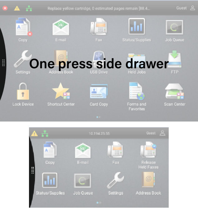
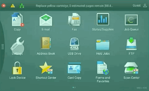
ONE PRESS SIDE DRAWER
This is also one interaction pattern common to Android and iOS which is to show more of the hidden access on the side. I made this as a one click access instead of dragging because it might get in-conflict with the side swipe interaction on accessing next or previous page of apps.
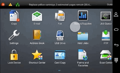
NAVIGATION BAR KEYPAD ICON
This concept allows users to see the keypad directly near to the common printer navigation buttons. This will be a departure from the common android navigation bar but nonetheless, it deserves to be tested.
Validate
An extensive usability test was prepared with 48 participants to undergo through a task-based test. The participants are divided into two, one set for the 4.5” screen size and another for 7.” During the testing, time was added as a factor to know how long will the participant finds the keypad access and how many tries it took for them to accomplish the task.
Both time-based, and success rates were measured to paint a better picture of users' insights. After each task, the participants were interviewed to understand in-depth their thoughts and expectations. The other concepts were also shown, not to undergo the same task but to solicit feedback on which versions they would prefer. This gives better gravitas and data to the user on the results.
Conclusion
Outcome
The result yielded some unexpected insights. We found out that;
• The version with the least errors on task-based was the navigation bar keypad icon (#4),
• The one with the least amount of time to find and easiest to recognize was the sideswipe drawer (#2).
• The one perceived the easiest on the interviews is the side swipe drawer (#2).
• The one with the least amount of time to find and easiest to recognize was the sideswipe drawer (#2).
• The one perceived the easiest on the interviews is the side swipe drawer (#2).
By observing the users in the task, it is easy to decide to go for nav bar keypad icon (#4) but this introduces another complexity because Lexmark printer panels are designed to look and feel like an Android OS devices. Adding one more button on the nav bar is a departure from the common 3 buttons android has. This takes a cognitive shift and re-learning if we will add a 4th button on the nav bar.
The system status keypad icon was the most voted concept by the business stakeholders, engineers and developers, but failed to meet the expected access from the participants, and also the least recognized function.
According to the users, the bottom drawer seems hard to swipe up and maybe a lot harder to open for people with mobility problems especially the seniors. On the other hand, the side drawer is the easiest because it can be opened on one press, the issue they pointed out is that it has a high tendency to open the app near the drawer.
After further deliberation and discussions within the UX team, the proposed design is the one press side drawer access (#2). This was presented to key stakeholders and was included in the design for future Lexmark printers.
Key takeaways
Empathy is key
Immersing myself to the user’s perspective made me understand what were important to take note and be able to shape the design around that.
Suspend judgment
Being able to set aside my biases and personal preferences allowed me to see all possible design solutions and validate with equanimity.
Soft skills
Collaboration is pertinent when design products, and that requires communicating design to stakeholders. I learned to listen intently, push for decisions, and acknowledge printer limits in order to ship the product.
What went well
Shape the process according to the project need
This project became a good exercise in ddesign and validation process to address the needed data and insights for the project. Since the design seems to lean on quantitive means due to numerous versions, more extensive tests and interviews were done even before the designs were created.
What would you do differently?
Address all system limitations on the onset
When I designed the wireframe and prototype, I assumed that the printer can cater to the smooth animations but due to the limited printer memory, some concepts which have a high chance of acceptability may not even see the light of day since the printer may not be able to render the animation well. This costs some delays with the detour of the design process and brainstorming sessions within the UX team. It is good to capture this before proceeding further but it would have been a lot better to have the system capacity before even starting
I could have taken account the different skill level
users have different ways of using the printer, that became a challenge since doing instant copy using the tactile keypad can be done in multiple different ways that may not need the keypad itself.