Overview
PostNord is an established logistics company in Sweden that operates also in Norway, Finland and Denmark. The company have a business portal for users to manage the parcels and shipments. One of the apps I was assigned to is the Claims Business app where users can submit a claim for delivery issues like damages, delays and missing parcels. I was leading the UX research and design while I work with three developers and a product manager.
Challenges
1. Users are unsure on what what information to add and what type of documents to upload, and are limited by file size limit when creating claims.
2. The review process at PostNord takes a long time because sometimes the documents are lacking, or not in the right quality.
3. Cater for the requirements in Sweden, Finland, Denmark and Norway
Goal
- How might we reduce friction and provide transparency on the end-to-end process of claims, so that PostNord employees and end users be more productive at work.
Discovery
When the project was kicked-off I was given free reign on how I plan to approach the redesign. I gathered the devs, the stakeholders and the PM on a discovery call for me to see the lay of the land and get a better picture of what is at stake for the redesign. I conducted focus group discussions, service blueprint workshops and user surveys for me to understand the needs of the users and the different internal processes on filing a claim.
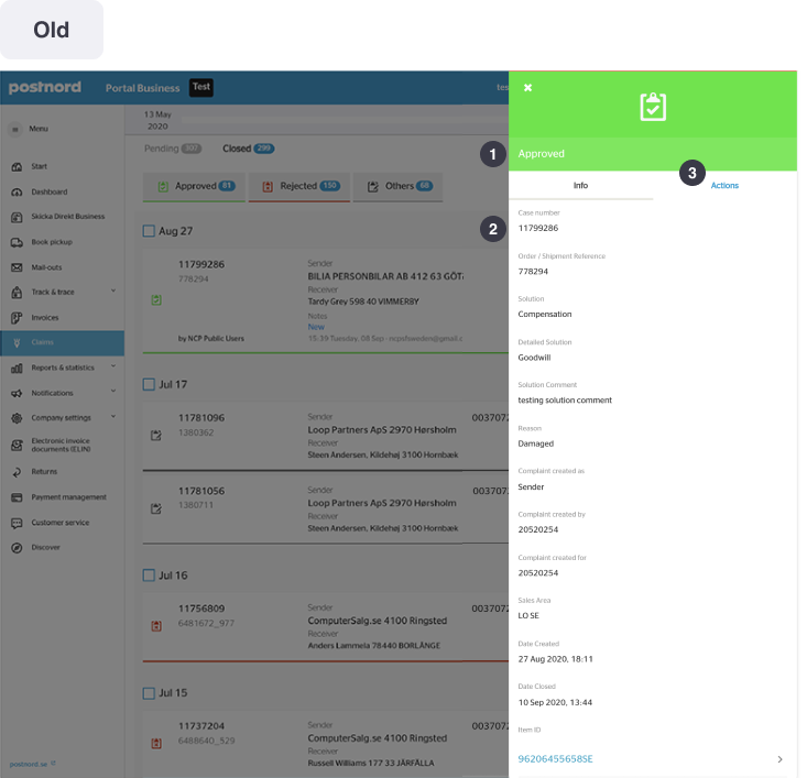
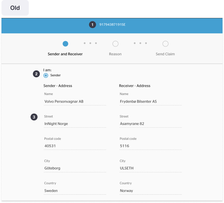
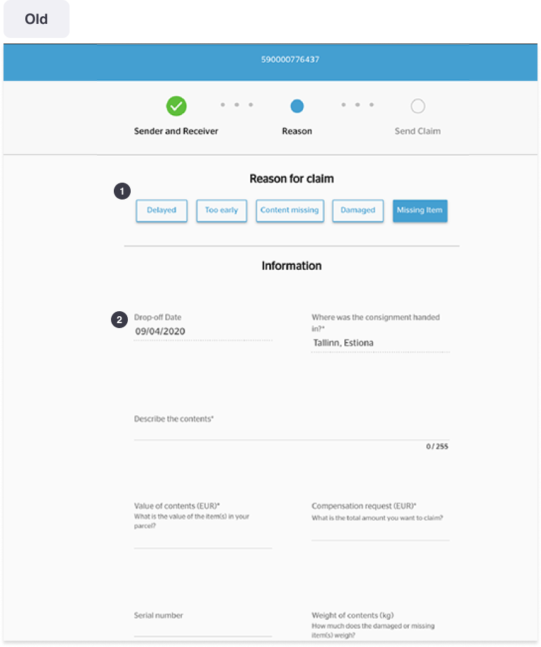
Old Claims App
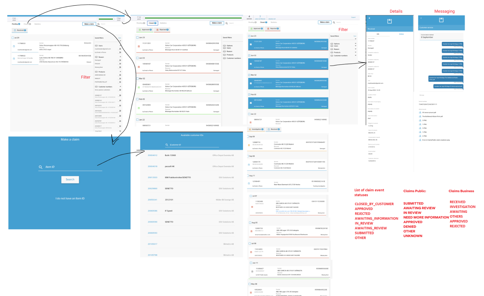
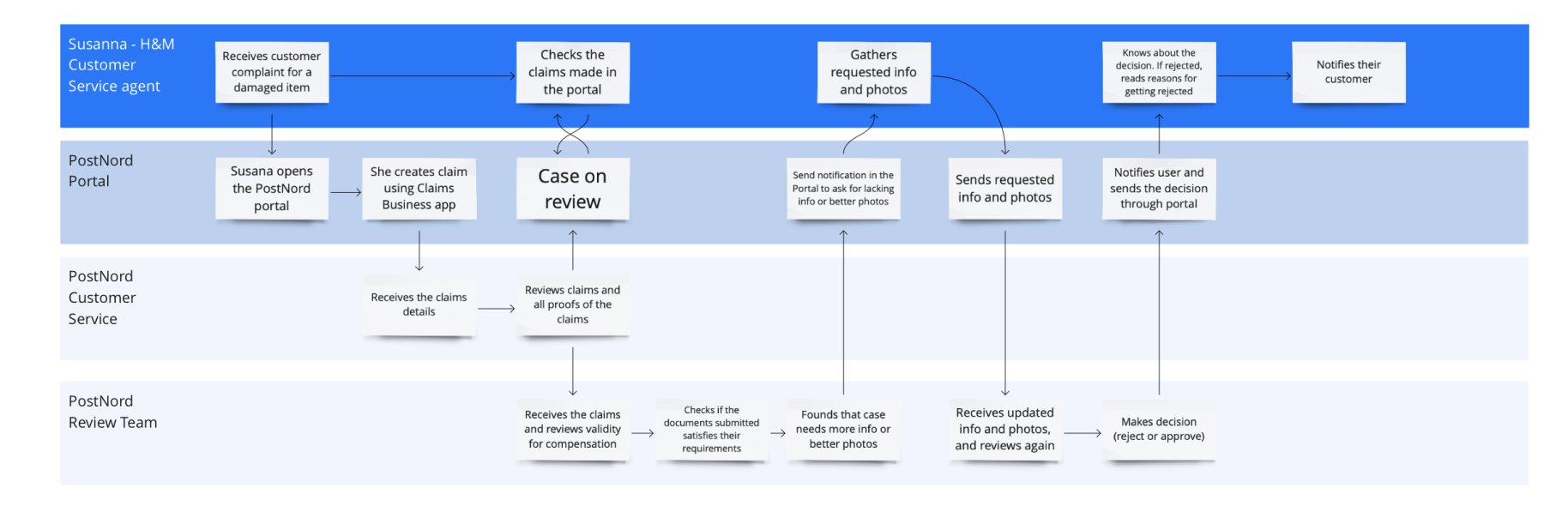
Service BluePrint
I organized a workshop to address the gap in the journey map with the business stakeholders and tech team. During the discussion, I learned that the review team was disconnected from the digital claims process and unaware of the online portal where claim requests were submitted. I explained the claims process to them and highlighted the importance of their role in the process. The team was surprised and appreciated their value even more. By bridging the gap between the review team and tech stakeholders, we can improve the claims process's efficiency and effectiveness, resulting in a better customer experience.
Research
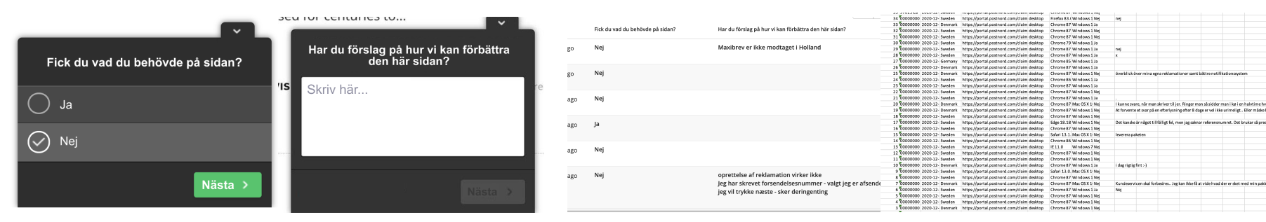
I have conducted a series of focus group discussions with our business customers to know their thoughts and pain points in using the Claims app. To supplement the needed data, I run a poll in the claims app which will cover quantitative and qualitative surveys. Below are the screenshots of the data gathering method using Hotjar survey.
User insights
The user insights I have uncovered are focused on making their work efficient and quick. A few of the insights are as follows; the users feel they are not given enough file size to submit evidence, and there are also no clear instructions on what documents to submit. With this in mind, I proceed to design the wireframe to resolve user pain points.
Insight 1
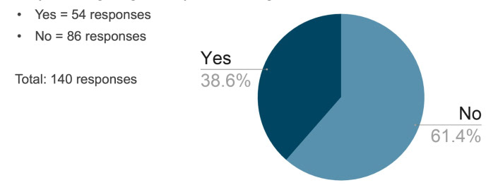
Only 38.6% of the respondents answered Yes on the question, “Did you get what you are looking for?”
I hypothesize that users in the Claims app are normally seeing a long list of claims which makes it hard for them the check each.
Another issue is that the users are overwhelmed with different data they are seeing at once.
Another issue is that the users are overwhelmed with different data they are seeing at once.
Insight 2
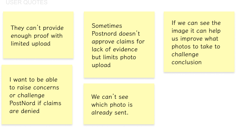
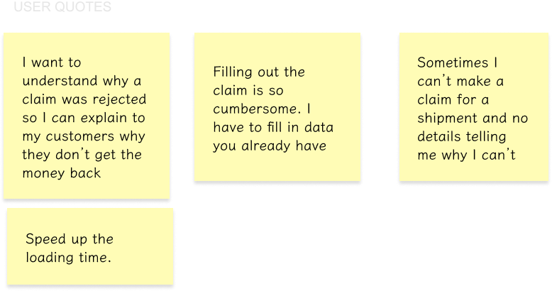
Users feel that they are not given enough space to submit evidence
There is a technical limitation that prevents users to submit beyot 5 mb per file and upto 5 upload only.
With no clear instructions, users don’t know specific documents to submit.
With no clear instructions, users don’t know specific documents to submit.
Insight 3
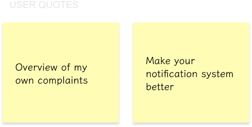
Users want to be notified for any updates about the claim
Users want to get answers fast,
They don’t want to keep on checking if there are updates on the claims they have created
They don’t want to keep on checking if there are updates on the claims they have created
Insight 4
Users want to do their jobs fast and efficiently
With no clear instructions, users are at a loss on what evidence to submit for a claim
They are serving their customers too so they want to update their customers as quickly as they can.
They are serving their customers too so they want to update their customers as quickly as they can.
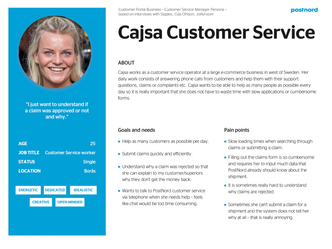
User persona
Wireframe

Userflow

Visual Design
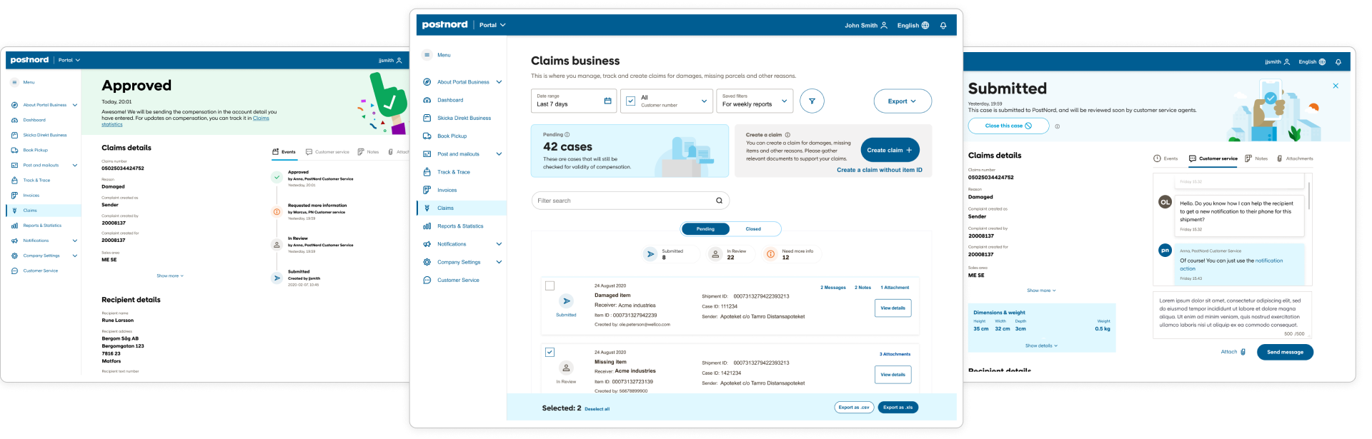
Claims Landing Page
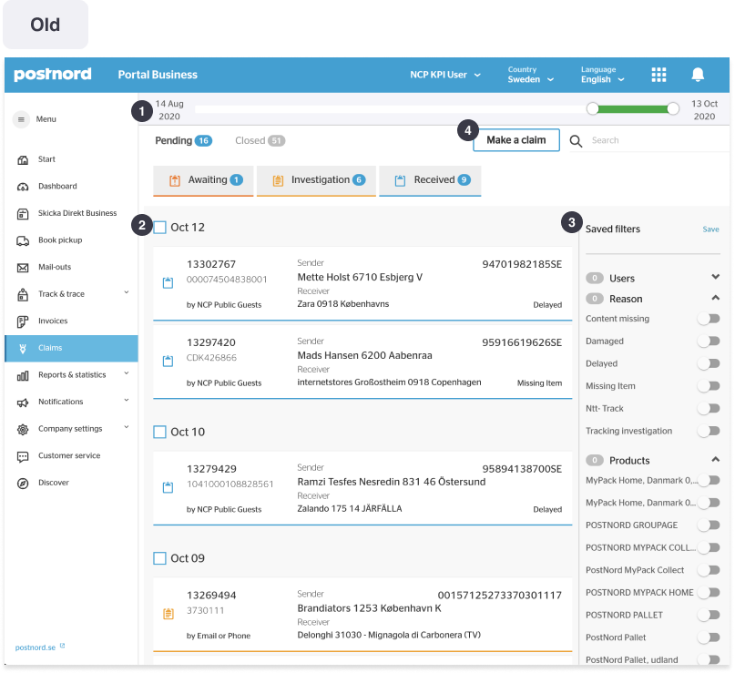
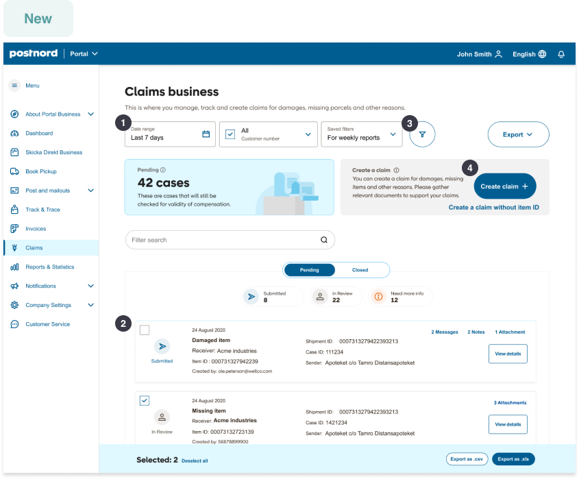
1. Date range picker: The date range slider is hard to select specific dates.
2. Claims list: The claims list need to have clear labels for the numbers while also show the most important information for the user to identify each claims.
3. Filters: The filter gets to be overwhelming and confusing because of the large number of options and having it on the side makes it easy to ignore.
4. Make a claim: The make a claim button, one of the most important action the user is now very prominent.
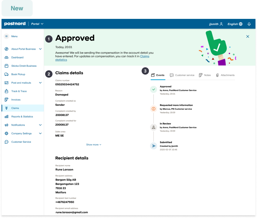
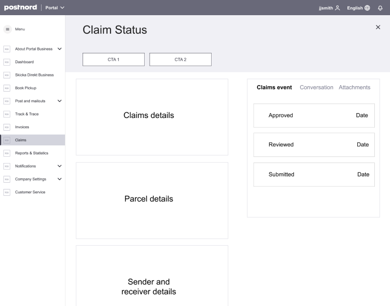
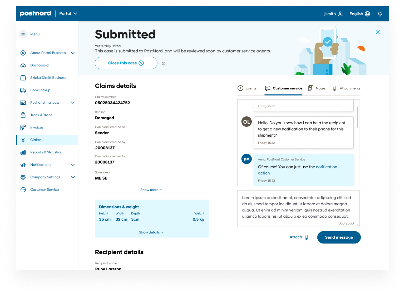
Claims Details
1. Claims status: I highlighted the status with large bold font to be seen immediattely. I also added an illustration to support the message.
2. Claims details: I made use of the same list of details but clustered them according to claims, recepient and sender details.
3. More Actions: Since actions are important, I showed it in a tab menu so that users can see the events on the onset. users can also send a message to customer service while being able to scan through the claims details on the side.
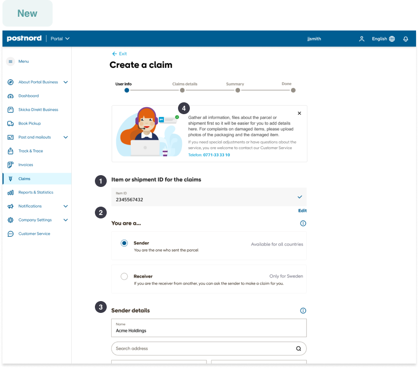
Claims Creation
1. Selected shipment: I place the item ID right above the details form so the user know what is it they are making a claims for. I also added the option to change just incase they made a mistake or wants to have another one.
2. Type of Claim: Since this is very crucial in making a claim, I added more information on the scope and limitation of each and also some additional details because this differs from country to country.
3. Shipment Info: As an improvement for hte input field, I creaded a search address where the user can search and auto-populate from the list suggested. And, they can also fully edit the text fields. To also help the user in the claims creation I added tool tips and additional info to unclear labels.
4. Create a claim instructions: We receive a lot of concerns about the lack of help or guidance in making a claim. So, I added an area where the user will be guided and be oriented what is expected from them.
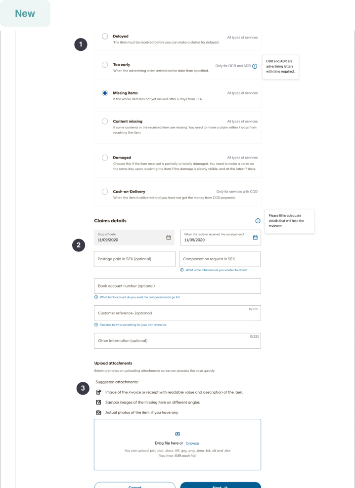
Claims More Info
1. Reason for making a claim selection: I displayed more details of each reason and also added limitations so that the user knows better which to select.
2. Claims details form: I added clear tool tips and additional information on the fields that will not be easily understood.
3. File upload user guide: Upon talking to the reviewers of PostNord, they listed down the requirements they needed to review the claims better and make a decision faster. This can help the user also prepare on their end the documents.
Key takeaways
Empathy is key
Immersing myself to the user’s perspective made me understand what were important to take note and be able to shape the design around users’ paint points.
Documentation helps
Being in an agile environment means that the process should be calculated to have optimal results, it is prudent to do documentation on the side to help with decision-making the future.
Soft skills
Being able to present my ideas and show the value of design is really a game changer and makes it a lot efficient on navigating through arguments, and turning that into productive results.
Trust your gut but be objective
Trusting your gut is the quickest way to move forward in the design process but it is also prudent to be objective and not be swayed by biases.