Background
PostNord is a logistics company operating in Sweden, Norway, Finland, and Denmark which serves both business and private users. Due to the wide customer base, PostNord launched the online portal so users can manage, track and book services that PostNord offers.
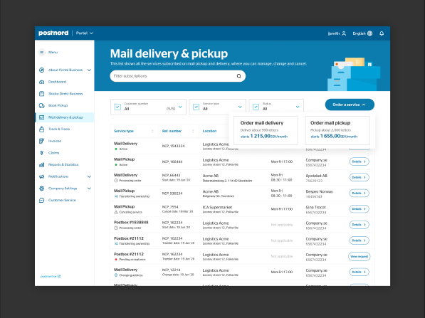
I was tasked to design the mail delivery and pickup app in the portal which is an avenue for company admins to order mail deliveries to their company post boxes and pickups in their office. Previously, this is done manually through sales admin calls or by sending a simple form requesting an order, cancel changing location, and transferring ownership.
• 21, 000 business customers since 2019
• Millions of customers per year
• Turnover of 500M Swedish Krones/Yeear
• 21, 000 business customers since 2019
• Millions of customers per year
• Turnover of 500M Swedish Krones/Yeear
Problem
The Environmental Report page needs a revamp to cater for the new CO2 calculation and to answer the need for improvement.
Goal
Open the Environmental reports to more business users because there has been a huge demand to be more sensitive to CO2 emissions.
Roles, responsibilities, and teammates
I lead the UX Research and also was responsible for both UX and UI designs for this project. I collaborated frequently with the product owner, business stakeholders, sales team, devs, and QA testers.
Discover
As guide, below is the flow of a user of Claims Business. The user here is a customer service agent who handles parcel claims from their customers. Let’s say a customer orders in H&M, then PostNord delivers the product, once the product is delivered, for any issues of the product the customer will contact H&M customer service. If the customer service thinks that PostNord is held liable on the issue, then he/she will create a claim in Claims Business in PostNord Portal and will like request a compensation for damages.
Based on the collaboration with different stakeholders and the requirements gathered, the following problems need to be addressed by the UX team:
• The redesign should address the needs of the user but keep elements familiar for common users.
• Assist users on making a claim to increase chances of getting approved.
• Align the design of the new branding of PostNord.
• The redesign should address the needs of the user but keep elements familiar for common users.
• Assist users on making a claim to increase chances of getting approved.
• Align the design of the new branding of PostNord.
The old version of the Environmental Report
Below is the screenshot of the old version of the Environmental Report page where users get data of their CO2 emission of their company through logistics services at PostNord.
Research
Based on the problems, the following Research Questions were formulated:
• How to improve and simplify getting CO2 emission data.
• How to align all the teams involved in each of these processes?
• How to cater for old and new CO2 calculations for old an new users.
• How to improve and simplify getting CO2 emission data.
• How to align all the teams involved in each of these processes?
• How to cater for old and new CO2 calculations for old an new users.
In order to answer the research questions, the following UX research methods were conducted:
• Gather customer service calls related to Claims Business
• Interview users and gather insights
• Persona creation
• Usability testing (future)
• Gather customer service calls related to Claims Business
• Interview users and gather insights
• Persona creation
• Usability testing (future)
Gather customer service calls related to Mail delivery and pickup
I talked to customer service to ask about calls from our customers and I found some that needs to be address in the new design. One of which is that their claims compensation gets rejected because they don’t know what document or photo they have uploaded already which makes them to upload any document when the agent assigned to review asks for more proof.
Persona creation
This method showed that the users are, most of the time, handling different tasks at a time which requires less time to focus on one and their goals as customer service agents.
Journey map
This journey map will show the path of the admin user for this specific app.
Answering the questions raised in defining the problem:
• How to improve and simplify claims creation?
In order to assist the user on making a claim, it is imperative to be able to auto-fill as much data as possible and define clearly what they needed to do in order to increase chances of getting approved since all details in claims creation is not editable after being submitted already.
In order to assist the user on making a claim, it is imperative to be able to auto-fill as much data as possible and define clearly what they needed to do in order to increase chances of getting approved since all details in claims creation is not editable after being submitted already.
• How to assist users in managing claims, especially for follow-ups?
Users seems not to get notifications when PostNord customer service is asking for more information, this leads to updates getting ignored and claims rejected.
Users seems not to get notifications when PostNord customer service is asking for more information, this leads to updates getting ignored and claims rejected.
• How to aide users when their claim is rejected??
When a claim is rejected, all they wanted to know is the reason why it is rejected so they can explain their customers and also that they know how to respond on it next time they face the same case.
When a claim is rejected, all they wanted to know is the reason why it is rejected so they can explain their customers and also that they know how to respond on it next time they face the same case.
Design
The following design solutions were proposed based on the insights gathered.
ALLOW NOTIFICATIONS OF NOTES, CHATS OR UPLOADS
Providing notifications can alert users when PostNord Customer Service (PN-CS) requests for more info or questions are raised.
SIMPLIFY AND GUIDE USERS IN CLAIMS CREATION
Simplify the required field and auto-fill what can be added to help reduce the info required.
IMPROVE LABELS IN CLAIMS MANAGEMENT
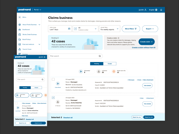
Clean up the claims list, remove unnecessary details and make the interaction noticeable.
ADD PREVIEW AND THUMBNAIL VIEW OF UPLOADED ATTACHMENTS
One reason that claims were rejected is because users can’t see what the uploaded attachments are. This leads users to upload files blindly because they can’t recall what was uploaded nor track who uploaded the files.
ADD REASONS WHEN A CLAIM IS REJECTED
Getting their claims rejected maybe disappointing to the users but knowing the reason why will help them explain to their customers better. That is a lot satisfying than having with no idea what to tell to their customers.
Integrating visual design process
After capturing all necessary information about the user, and knowing what areas to improve I inject the visual design process in my UX process so that it can quickly be shown to stakeholders and gather feedback for improvement. Shown below is my UX/UI Design process injecting the design system and prototyping wireframes.
Environmental Reports
After so many iterations and discussions with business stakeholders, developers, and the UX team, the new mail delivery and pickup has been approved. The design addressed all questions and problems that were stated above.
Here are some break down of the screens that I designed to satisfy the different requirements in business rules and user needs that were specified.
The landing screen for mail delivery and pickup is a list of the user's subscriptions where they can track, update and manage their order services depending on their business needs..
• Big companies can have as much as 20 to 50 services at a given time so it is important to have search filter and have statuses in each service to tracking.
• Big companies can have as much as 20 to 50 services at a given time so it is important to have search filter and have statuses in each service to tracking.
Overview
Here I made the details as brief as possible so users can make decisions easily,
Buttons were added in strategic areas so users will not be searching around where to initiate actions
Aggregate List
Ordering or booking service has been one major action the users do in mail delivery and pickup and also one that provides income to PostNord. With that, we made sure that the experience should be top-notch.
We guide users as they fill in relevant information for ordering, and as much as possible we auto-fill the fields that we can fetch.
Export file
After the user has made the order, my intent is to show the user that they have done it successfully.
An important part is to tell the user what will happen next as they await their first delivery or pickup.
An important part is to tell the user what will happen next as they await their first delivery or pickup.
Validate
The Claims Business v2 will be tested through usability testing in upcoming months due to limitation of participants.
Conclusion
Outcome
I may not be able to show outcomes since we have not done a usability test yet which will verify how the design solution fits in the issues that plagues our users.
Key takeaways
Empathy is key
Immersing myself to the user’s perspective made me understand what were important to take note and be able to shape the design around users’ paint points.
Documentation helps
Being in an agile environment means that the process should be calculated to have optimal results, it is prudent to do documentation on the side to help with decision-making the future.
Soft skills
Being able to present my ideas and show the value of design is really a game changer and makes it a lot efficient on navigating through arguments, and turning that into productive results.
Trust your gut but be objective
Trusting your gut is the quickest way to move forward in the design process but it is also prudent to be objective and not be swayed by biases.
What went well
Shape the process according to the project need
It is imperative to adapt the design process according to the needs of the project and the time required to finish. I was able to adjust the design process according to what is required in each phase.
getting a response from BUsiness stakeholders
Booking a meeting with stakeholders proves to be hard to come by since they are mostly busy, so we set a weekly meeting with them to talk and demo the design. It became a good avenue to discuss rules that applies in Norway, Denmark, Sweden, and Finland
What would you do differently?
Do more meetings with technical stakeholders
When gathering requirements, there are times when the person-in-charge of the tech may not have the ready information you need and sometimes you get pushback later which was not informed beforehand. This became huge friction during the process because it caused me to go back and forth on the design because some end-points are not available.
