Overview
SPINS is a leading provider of wellness data analytics for the Consumer Packaged Goods (CPG) industry, leveraging years of expertise to deliver market insights to retailers and brands of all sizes.
PowerTabs, an established Excel-based reporting tool, has been instrumental in helping 300+ brands analyze sales performance and identify market trends over the past five years. This project aimed to transform PowerTabs from a static Excel report into a dynamic, scalable dashboard, offering users an interactive and data-driven experience for deeper market analysis.
Challenges to Address
• Brands need a comprehensive way to analyze their sales performance, compare it with competitors, and benchmark against the broader market within the same category.
• Users require interactive tools to manipulate and segment large datasets, enabling deeper insights and multiple perspectives for more informed decision-making.
Goal
The primary objective is to create a dynamic, interactive dashboard that allows users to explore and analyze data with flexibility while preserving the familiar components of the existing Excel report for a seamless transition.
Discovery
Using the sample PowerTabs Excel report, I conducted a thorough analysis of the available data and interviewed stakeholders to gain a deep understanding of user needs. Additionally, I facilitated focus group discussions and benchmarking to determine which elements should be retained or refined. Ultimately, I preserved key components to ensure familiarity while ensuring all measures and calculations remained accurate. As a result, users will experience a seamless transition when the report is transformed into an interactive application.
*I concealed brand and product names to protect sensitive information for SPINS and its clients.

Research
I leveraged interview handouts and stakeholder discussions to map out user tasks and behavior patterns upon accessing the report. Users prioritize viewing overall performance first to gauge their success. With the provided data, they can strategize their marketing and sales efforts to outperform competitors or evaluate the effectiveness of previous initiatives.

Main User Problems
Based on contextual interviews and focus group discussions conducted with the UX research team, I identified key user concerns. The following themes highlight the primary challenges users face.

Design Strategy
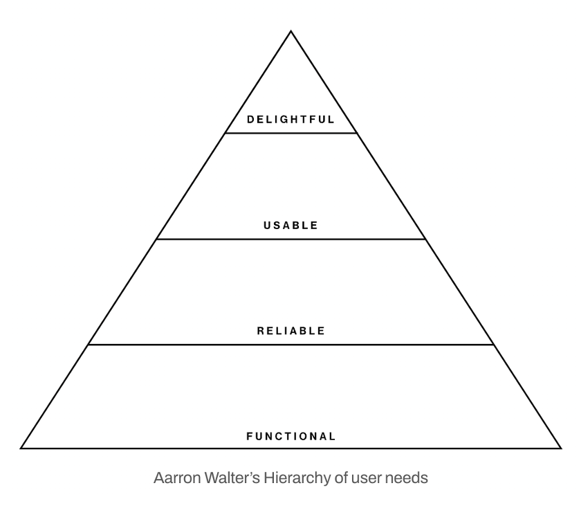
The Hierarchy of User Needs is structured as follows:
1. Functional – Provide users with the exact data they seek.
2. Reliable – Build user confidence through effective data storytelling.
3. Usable – Ensure intuitive filtering and navigation, even for first-time users.
4. Delightful – Present relevant information only when needed to prevent data overload. Given the vast amount of available data, we carefully curated visuals, measures, and datasets for each page, allowing users to quickly identify key insights.
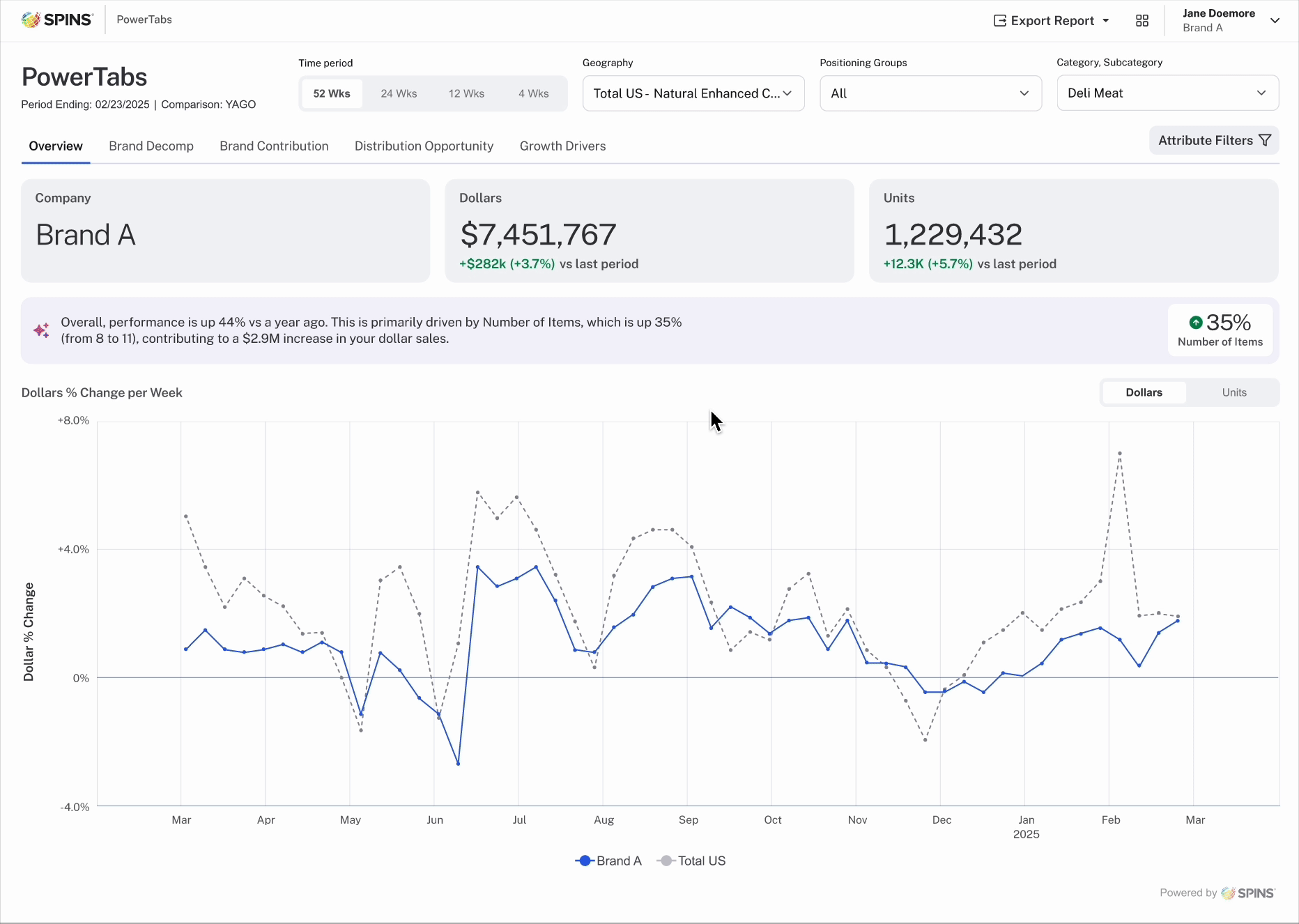
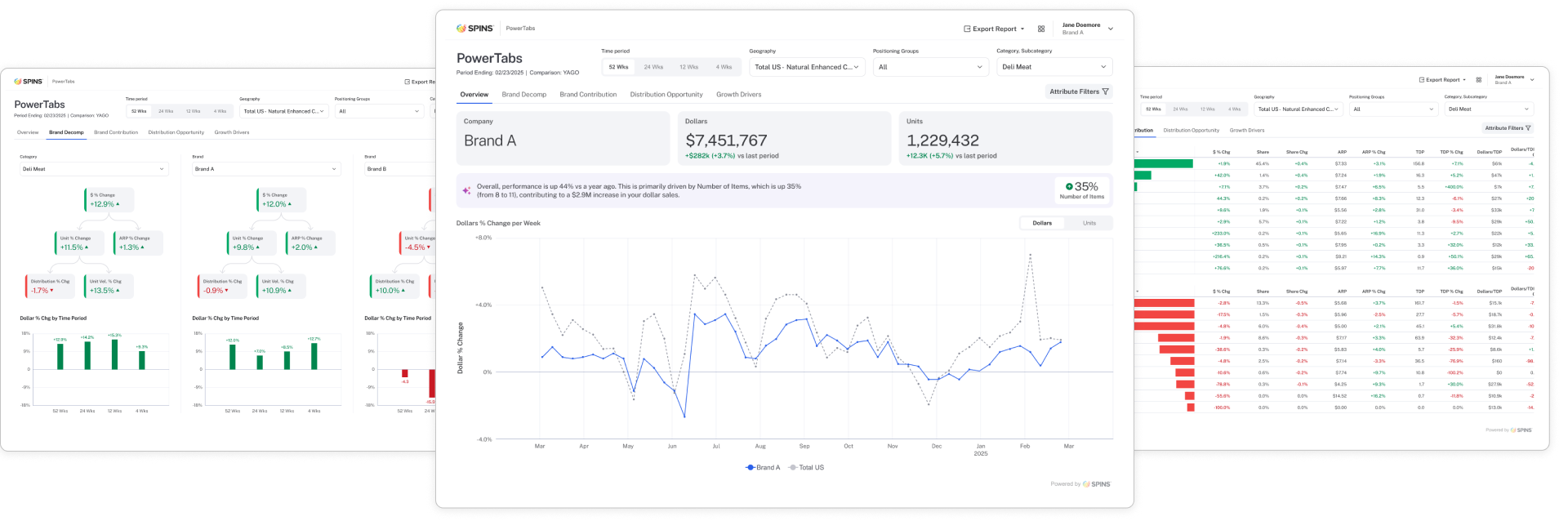
Overview Page
The overview page sets the tone and theme for the entire report. I strategically positioned key performance indicators (KPIs), such as dollars and units, at the forefront to allow users to quickly assess their gains over a specific period. Below each measure, I included year-over-year changes, color-coded for easy identification of growth or decline. Next, AI-powered insights surface trends and patterns within the extensive data set, providing valuable context. The final section features line charts displaying dollar and unit percent changes, allowing users to compare the brand’s performance against the broader market.

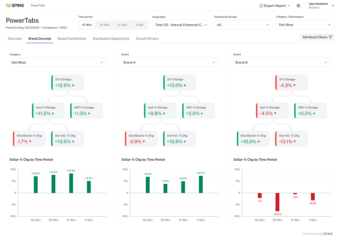
Brand Decomp Page
This analysis offers detailed comparative data to evaluate the brand’s performance at a granular level. The goal is for users to easily compare the brand’s performance against the overall category and its competitors. Users can also compare various metrics that roll up to the dollar percent change. Bar chart trends visually summarize performance across multiple time periods, providing a clear snapshot of how the brand is performing over time.
Brand Contribution Page
Brand Contribution illustrates how each brand impacts the overall sales of the category. The tables display the sales figures for each brand, along with key metrics for both the top and bottom 10 brands, providing clear insights into their respective contributions to the category’s performance.

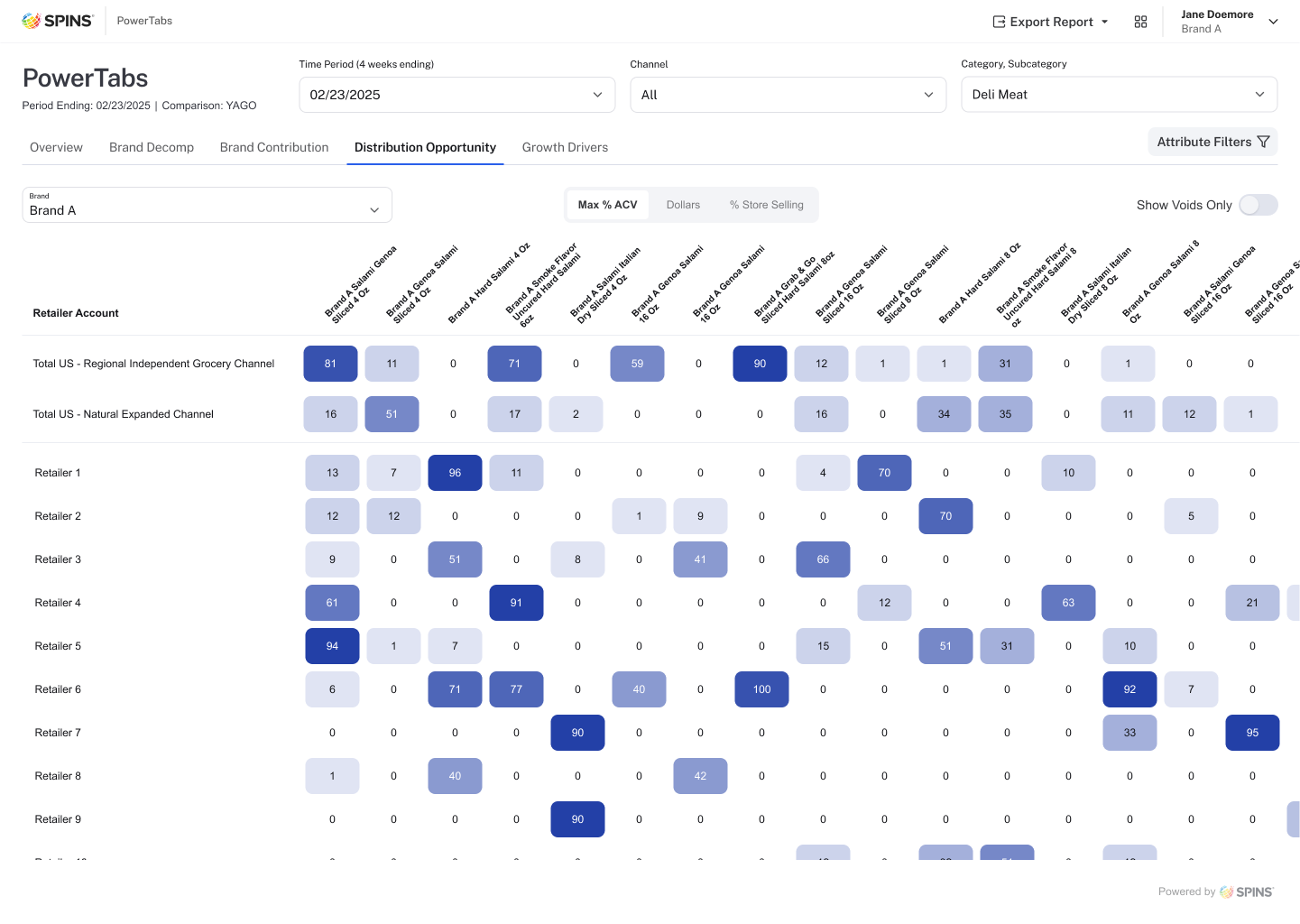
Distribution Opportunity Page
This section visualizes the distribution of a brand’s products across various retailers, highlighting areas of saturation and potential gaps in the market. It allows brands to identify where their products are currently sold and determine which retailers offer opportunities for expansion or require a reduction in distribution. By analyzing the selected metrics, brand users can assess product performance and make data-driven decisions to refine their distribution strategy.
FIGMA Prototype Walkthrough