Overview
SPINS is a leading authority in wellness data analytics within the Consumer Packaged Goods (CPG) sector. With years of experience in the wellness industry, SPINS provides actionable market insights to both small and large retailers and brands. The Fresh Produce Reporting project is focused on developing a performance dashboard for fresh produce categories such as grains, vegetables, and fruits across retail stores. While SPINS has already perfected UPC data, fresh produce reporting is a new area of focus. The goal is to unify and harmonize both UPC and fresh produce data, creating a seamless and comprehensive reporting experience.
Challenges to Address
• Retailers and grocery stores are seeking effective ways to analyze the performance of their fresh produce segment, which represents 40% of the total retail grocery market in the U.S.
• There is currently no efficient method for retailers and grocers to assess and compare the performance of fresh produce sales alongside packaged goods, limiting their ability to make informed decisions about their product offerings.
Goal
The primary goal is to create a single source of truth that enables retailers to gain a comprehensive understanding of the performance of their fresh produce section. This insight will be fully realized through two key perspectives: a focused view of individual store performance and a comparative view that benchmarks the retailer against competitors in the market.
Discovery
Fresh Produce Reporting is a performance dashboard designed to track and analyze sales data for fresh produce, including grains, vegetables, and fruits, across retail stores. This dashboard provides retailers with valuable insights into the performance of their fresh produce segment, allowing them to make informed decisions and optimize their product offerings.
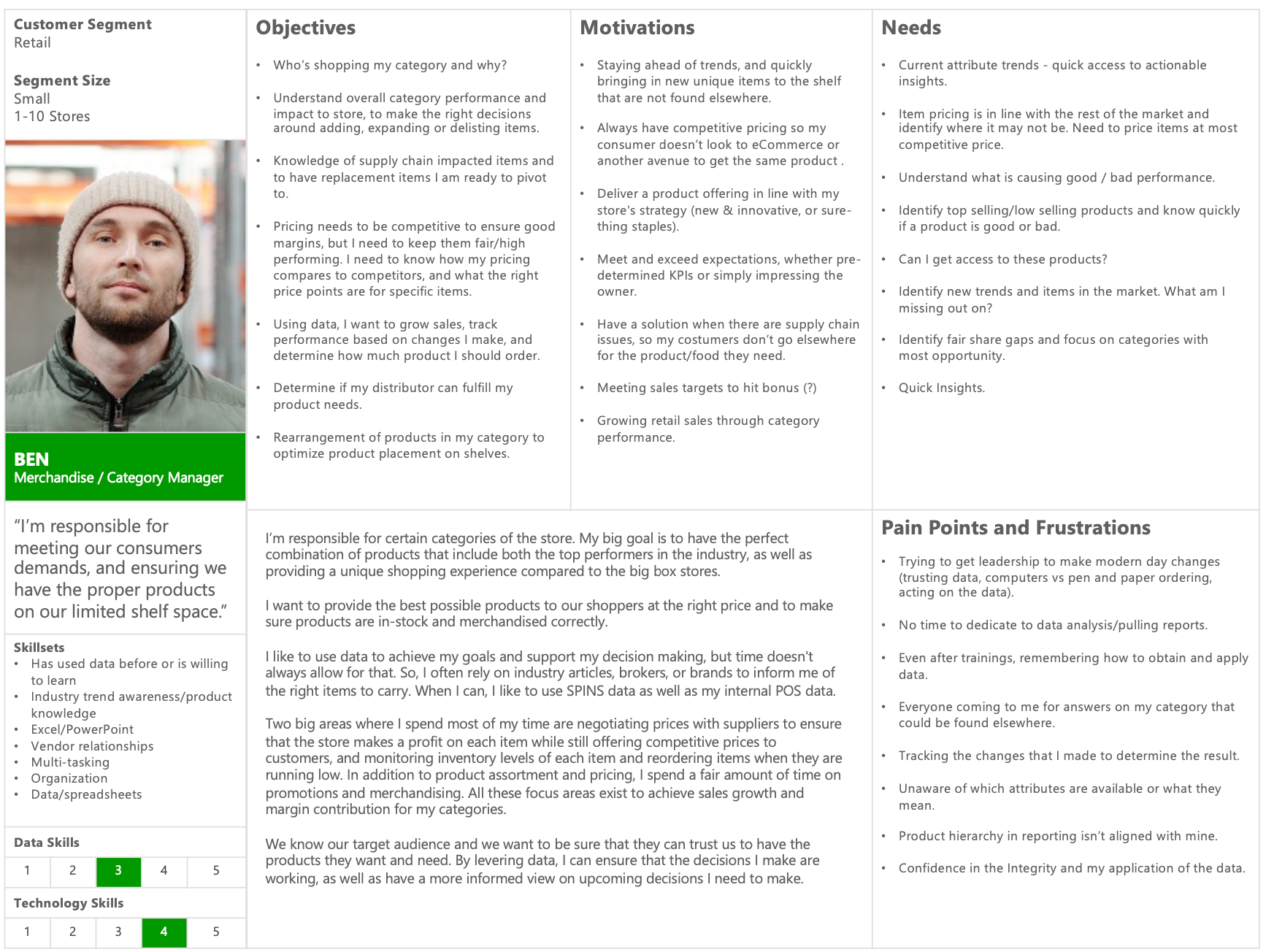
User Persona
The primary users for the Fresh Produce dashboard are category managers and CEOs of retail companies with produce sections in their stores. These individuals are focused on understanding the performance of both packaged goods and fresh produce. Beyond performance metrics, they seek a comprehensive view of seasonal data related to fresh produce, enabling them to anticipate demand, optimize inventory, and manage spoilage across stores in various regions. By having access to this holistic seasonal data, they can make informed decisions to improve stock management and better meet customer needs.

Research
I used interview handouts and stakeholder interviews to map out the key tasks and patterns our users would follow when interacting with the report. The primary need expressed by users is to quickly assess overall performance to determine how well they are doing. By leveraging the data provided, users can formulate marketing and sales strategies to outperform the market or evaluate the effectiveness of their strategies. This insight-driven approach allows users to take informed actions based on real-time data.
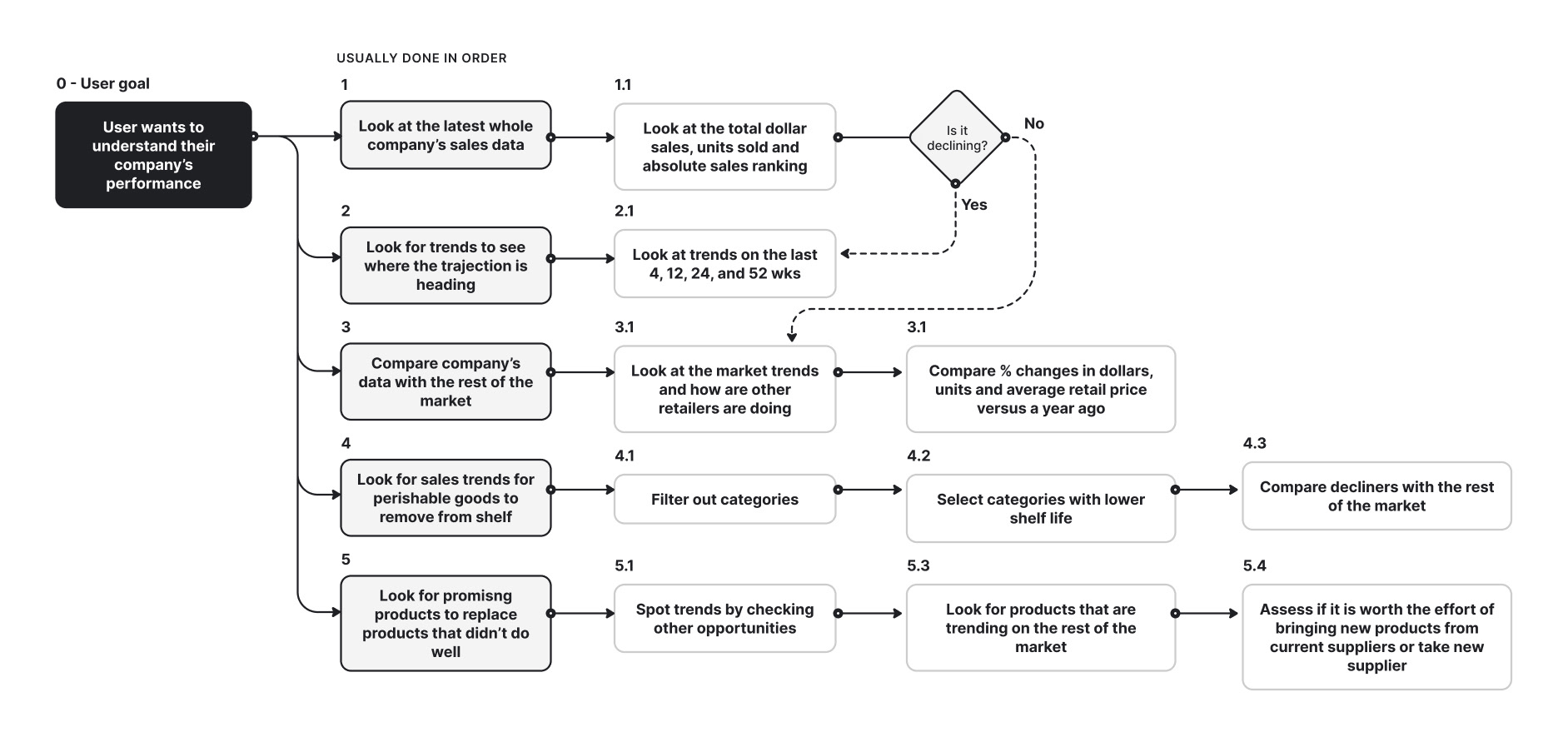
Main User Problems
I compiled the key user concerns based on contextual interviews and focus group discussions conducted with the UX research team. The following themes highlight the primary challenges users face:

Design Strategy
The Hierarchy of User Needs is as follows:
1. Functional: Show data that the user seeks
2. Reliable: Make users feel confident about the data through data storytelling
3. Usable: Make filtering and navigation easy to use even for new users
4. Delightful: Show information that the user needs only when they need it. With the amount of data we have it is easy to overwhelm users. We carefully hand-picked visuals, measures, and datasets to present on each page so users can easily spot the insights that they are seeking.

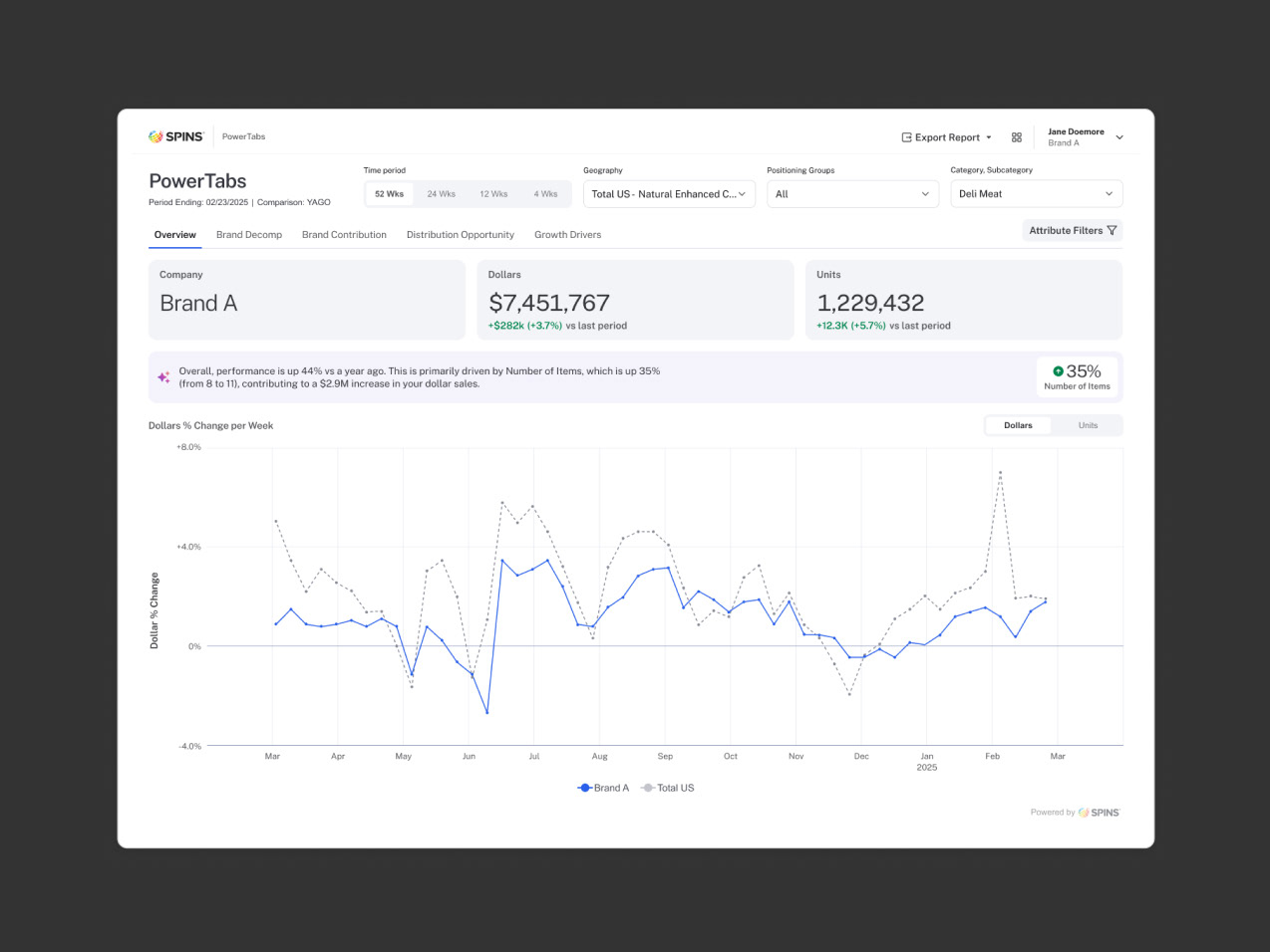
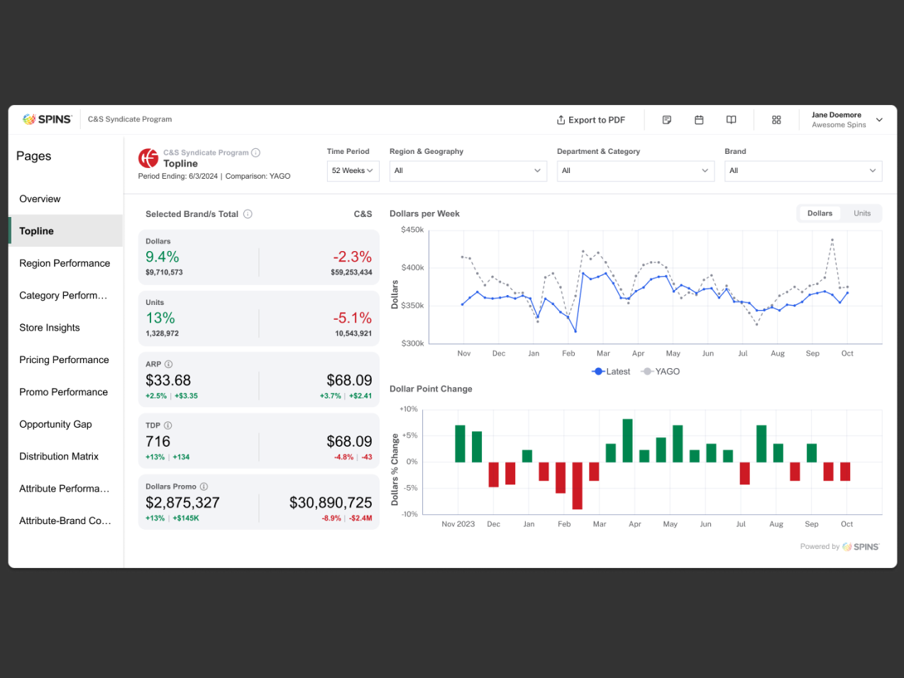
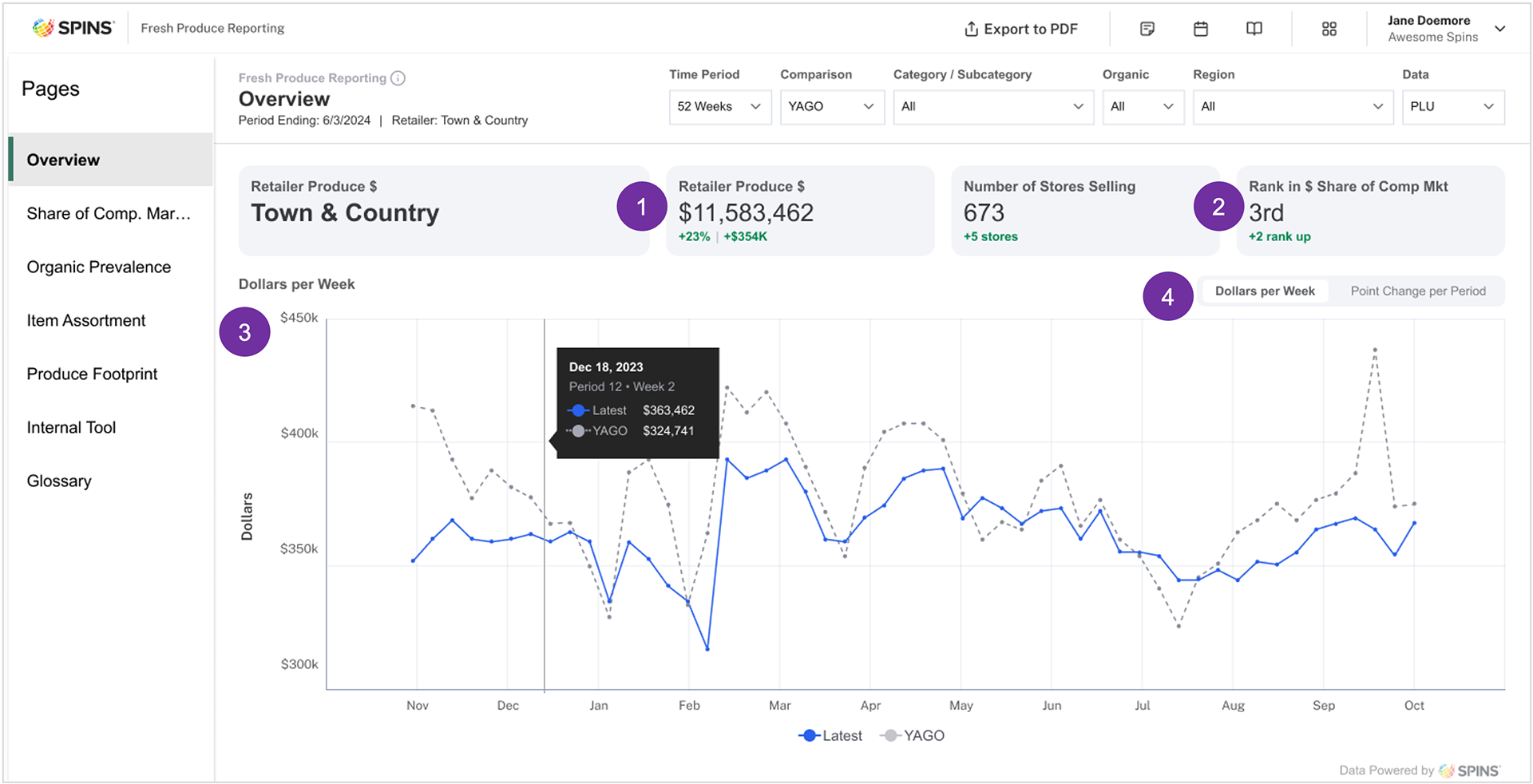
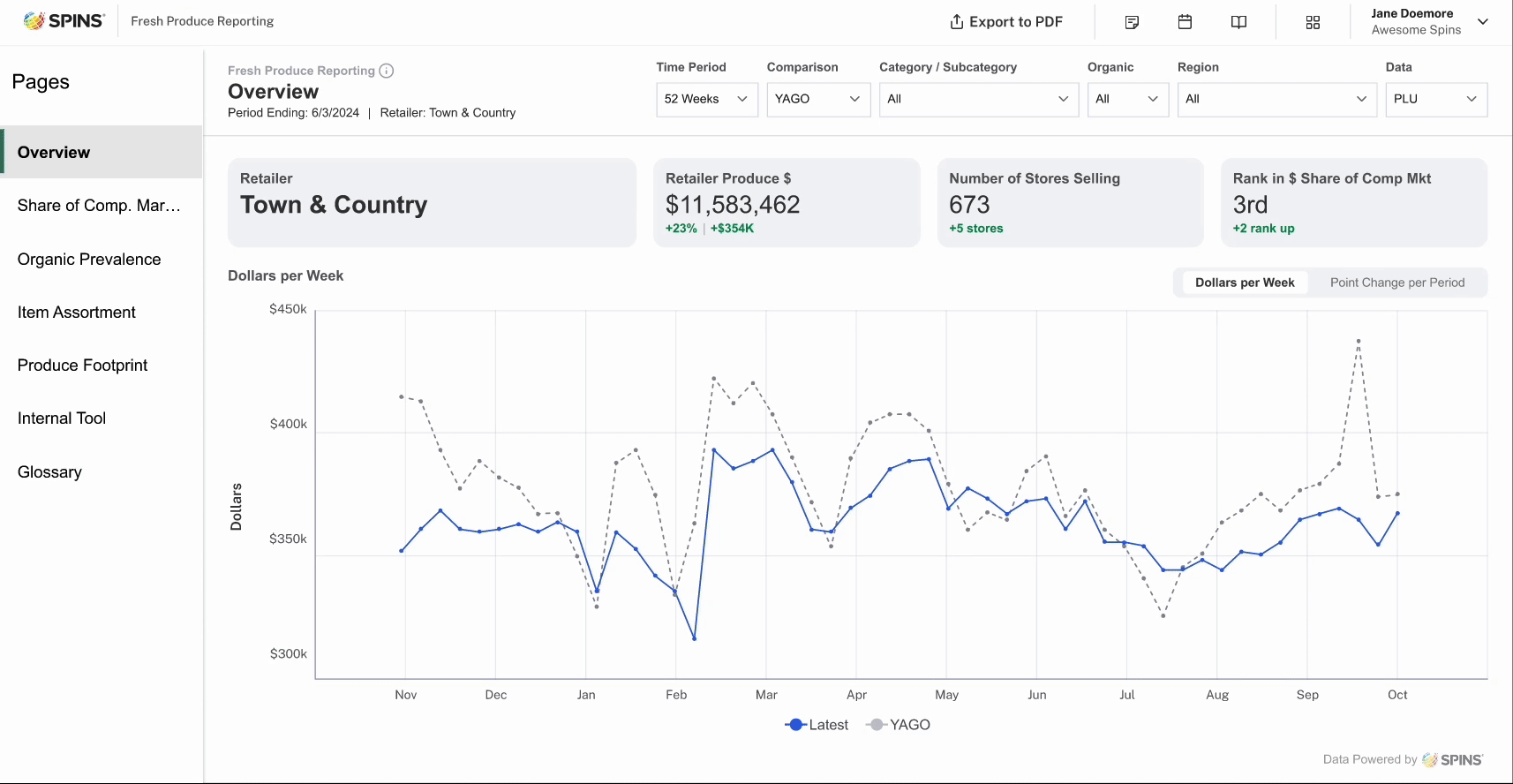
Overview
The overview page sets the tone and theme for the entire report, offering a concise yet comprehensive snapshot of key performance metrics.
1. The first data point users will seek is their total sales and the percentage change compared to the previous year, allowing them to quickly assess overall performance.
2. I’ve incorporated a ranking system to show how their sales stack up against the broader market.
3. The “Dollars per Week” chart visually illustrates sales trends over the past 52 weeks, helping users track performance over time.
4. A toggle feature has been added, enabling users to reveal additional visualizations without cluttering the page, ensuring a clean and flexible user experience.
Share of Comparative Market
This analysis offers comparative data to evaluate the retailer’s performance, with several key features designed for ease of use and in-depth insights:
1. Simple filtering for quick access to specific data, streamlining the analysis process.
2. Expandable rows that enable users to drill down into detailed subsections, offering a deeper look at performance.
3. Bar graphs integrated alongside tables to visually highlight top-performing categories for better clarity.
4. Market performance insights, providing a broader view of how the retailer compares to the overall industry.
5. Interactive data visualizations, allow users to identify trends by clicking on specific categories for a more focused analysis.

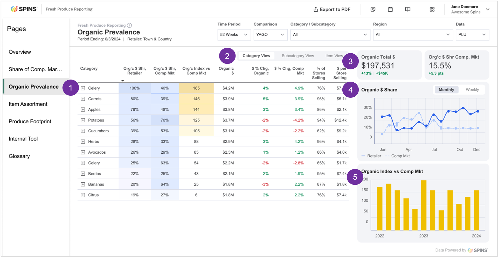
Organic Prevalence
We offer detailed view on organic produce, enabling users to differentiate it from other categories. Key features include:
1. Percentage of organic sales, providing a clear view of how much of the produce is organic.
2. Toggle options that allow users to switch between various levels of data hierarchy for a more customized view.
3. Highlighted key performance indicators (KPIs), drawing attention to the most important metrics.
4. Trend analysis, helping users track performance over time to spot growth or decline.
5. Market comparison, allowing users to benchmark their organic sales against the broader market.
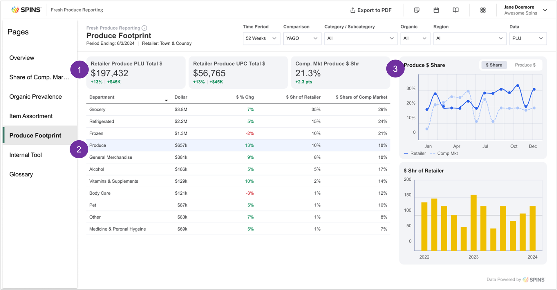
Produce Footprint
This section provides an overview of the Produce department’s performance within a retail environment, compared to other departments. Key features include:
1. Highlighted key performance indicators (KPIs), offering a snapshot of overall performance.
2. A focused view of the Produce department, ensuring targeted insights for users.
3. Market trend analysis, showing how the retailer’s Product performance aligns with broader industry trends, offering valuable context for strategic decision-making.
FIGMA Prototype Walkthrough
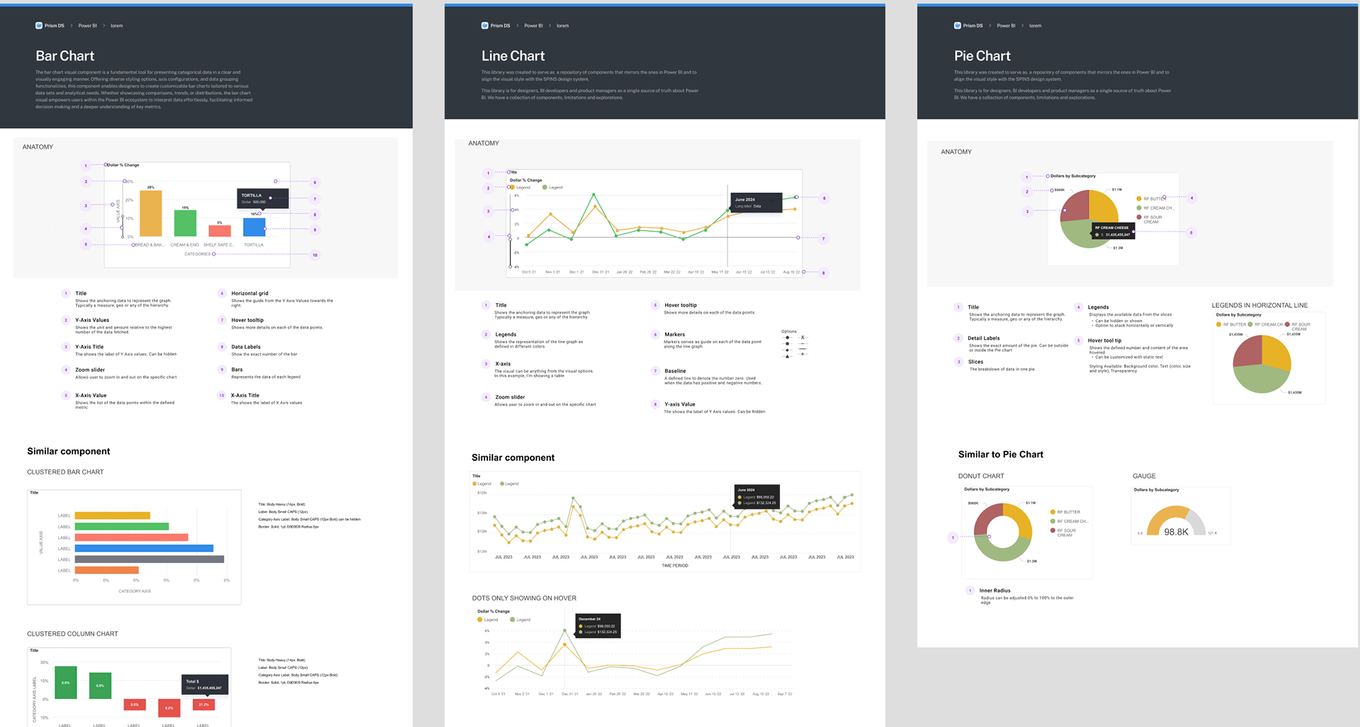
Power BI Design System
In addition to the designed Power BI app, I lead the development of the Power BI Design Library, a comprehensive guide that defines the design system for all Power BI applications. This initiative ensures consistency across the look, feel, and overall user experience of our applications, aligning with the unique constraints and capabilities of the Power BI platform. By establishing clear design standards, we aim to deliver a cohesive, seamless experience across all company touchpoints while maintaining flexibility for platform-specific needs.
Results
The design process progressed smoothly due to well-defined data, design systems, and functionality. My role was to integrate these components to effectively address user needs. The personas and user journeys played a key role in facilitating stakeholder discussions by providing valuable context for the Fresh Produce dashboard. Meanwhile, the prototype served as a clear visual reference, helping to solidify and communicate the overall vision for the report.
REDUCED DESIGN TIME FOR BI APPS
• Streamlined workflows minimize the need for frequent back-and-forth communication with developers.
• The review process is more efficient, significantly reducing the time spent on revisions.
FASTER IMPLEMENTATION
• Involving the review team early in the design process helped stakeholders align on the best ways to serve users.
• Eliminated silos and reduced misunderstandings between the design, product, and development teams regarding Power BI’s limitations.
QUICKER TIME TO MARKET
• The accelerated implementation process allowed us to bring the product to market faster, enabling quicker user feedback and iteration.